
The Grand and Rogue rivers meeting on an October morning
Frey Family Dentistry confluence mark

A brand study

Frey Family Dentistry

The whole brand, from the mark to the last postcard – built for an independent Belmont practice and the families who have trusted it since 1997.

Begin

Start with what is true.

Dr. John Frey has cared for northeast Grand Rapids since 1997. He sings with the Opera Grand Rapids chorus, accompanies a high-school choir on piano, and practices a few minutes from the neighborhoods where he grew up. His office windows look onto the White Pine Trail, where the Rogue River meets the Grand.

A brand was already living in those facts. Our work was to see it and give it form: the meeting of currents became the mark, the October riverbank became the palette, and the doctor himself – steady, local, known by name – became the voice. Nothing here is invented. Everything is arranged.

A dental chair facing a broad window onto pines, trail, and water

Three currents, one river.

The practice has worn three gold waves since before smartphones. Patients know them. So we kept them and gave them a direction: three currents that begin apart and flow into one – the way the Rogue joins the Grand beside the office, and the way three generations of one family end up in the same waiting room.

The current Frey Family Dentistry logo The evolved Frey Family Dentistry color lockup
The mark patients know, and where we took it.
The confluence mark in one-color die-cut form
One color, one weight – it cuts clean in metal, embroiders clean in thread, prints clean at any size.
  • From across the street: a smile, rising.
  • From the reception desk: two rivers joining.
  • From the sleep apnea chair: breath, moving freely.

Colors sampled from a real morning.

Every hex on this page was pulled from one place at one hour: the Grand–Rogue confluence on an October morning, plus the navy ink the practice already owned. If a color could belong to any brand, it belongs to none – these belong to Belmont.

River Ink#1E2A5A

Current Brass#B9922F

Birch Paper#F7F3EA

October Sky#C9D6DC

Pine Shadow#2E4438

Rogue Teal#3E6E78

A voice you can read for thirty years.

Fraunces speaks the headlines – a warm old-style with real ink in its veins, established without being stuffy. Alegreya carries the long stories, the way a good book does. Alegreya Sans handles the practical work of buttons and forms without raising its voice.

A dentist you can know by name.

Families who came in as newlyweds now bring their grandchildren.

REQUEST AN APPOINTMENT · MONDAY–THURSDAY 8AM–5PM

Written like a person, because one is speaking.

Template dentistry writes "Your smile is our passion." This brand writes the way Dr. Frey talks – plainly, warmly, with the honesty of a man who will tell you when something can wait.

Template: "State-of-the-art care for your whole family."

Frey: "We still close for lunch like a small town office should."

Template: "We create beautiful, confident smiles."

Frey: "The goal is a smile that looks like yours on a very good day."

Template: "Patient satisfaction is our top priority."

Frey: "When something can wait, we say so."

The front door, rebuilt.

Six pages, no templates, every image painted in one hand, every word written for this practice alone. The prototype is live – walk through it.

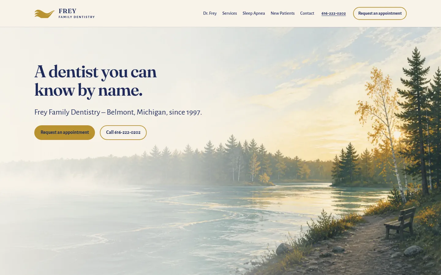
The Frey Family Dentistry prototype homepage at desktop width
The homepage. The headline sits in the quiet part of the sky, which we left quiet on purpose.
Explore the website prototype

The centerpiece

The page that pays for everything else.

When a dentist diagnoses a six-thousand-dollar case, the patient usually leaves holding a printed ledger of insurance codes. The decision then happens at home, at the kitchen table, with a spouse squinting at abbreviations – and case acceptance dies exactly there.

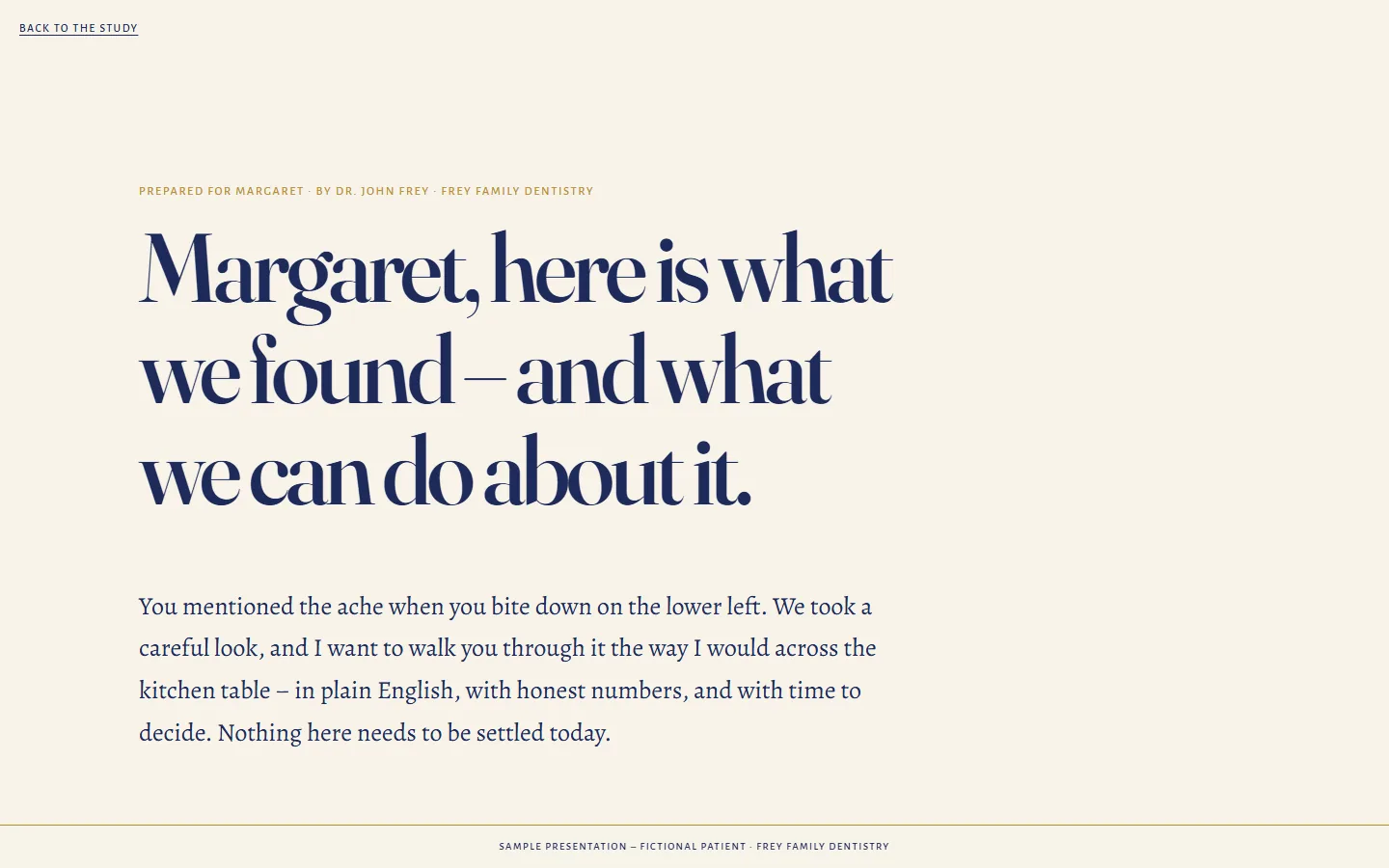
So we designed the page that should exist instead. After the exam, the coordinator clicks once, and the patient receives a private link: their case in plain English, what waiting costs, honest phased options with real numbers, and a word from their own doctor. It reads like the dentist sat down and wrote it for them, because with the practice's notes and our template, he effectively did.

This is where design stops being decoration and starts moving revenue. It is the artifact we are proudest of.

The opening of Margaret's fictional treatment presentation
Read Margaret's sample presentation

Margaret is fictional. The care in the writing is not.

A crescent moon over dark water and a pine shore

For the 9pm worry.

The other page every practice needs and none has: the one a patient opens the night after an extraction, wondering if the pink on the pillow is normal. Night colors, short sentences, the phone number where it can be found by a thumb at 2am. It lowers shoulders. It also prevents the panicked Tuesday call that was never an emergency.

See the companion page

The brand you can hold.

A brand becomes real the day it survives contact with paper, thread and brick. Every object below carries the same mark, the same six colors, the same hand.

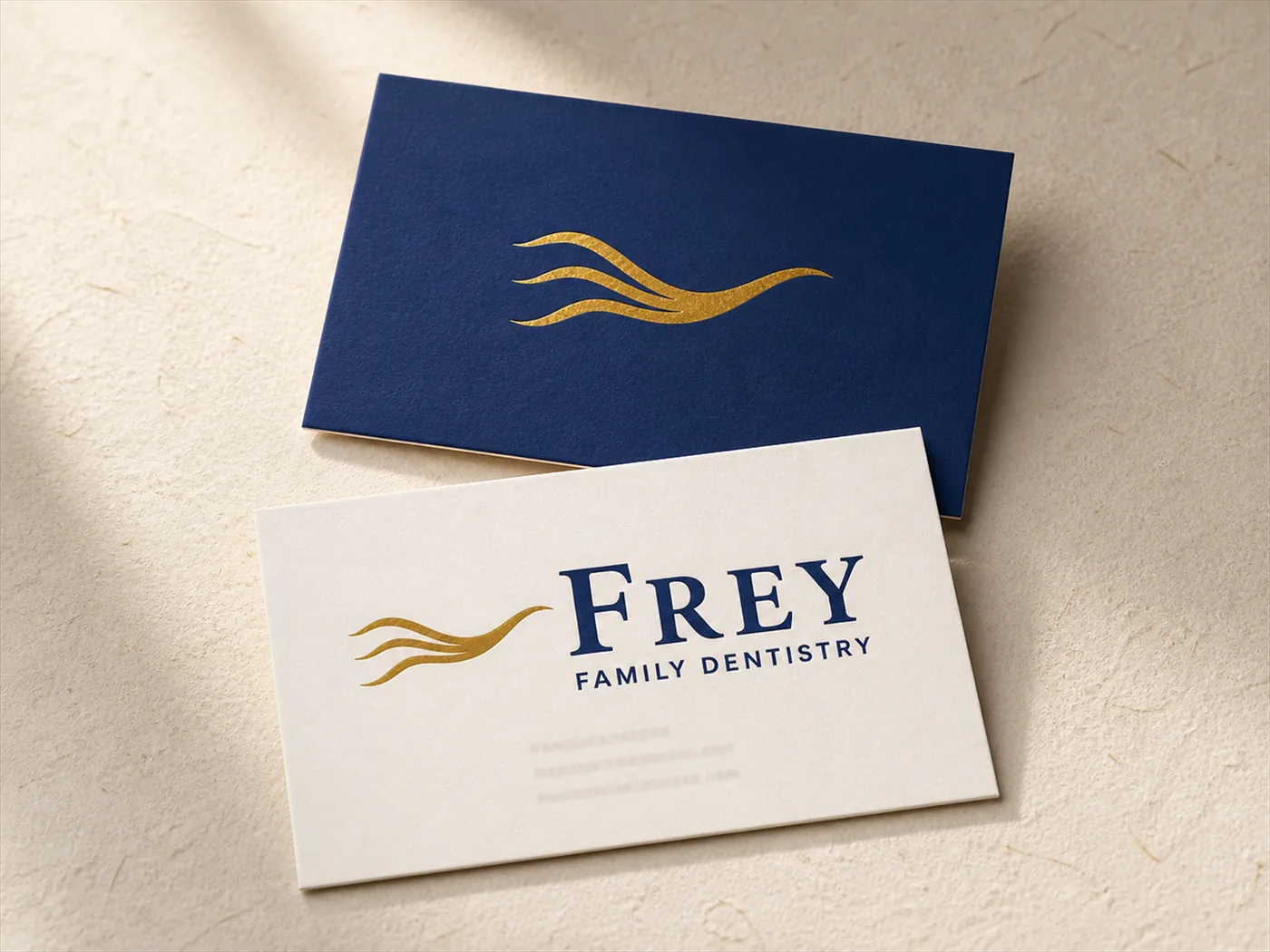
Frey Family Dentistry business cards on paper
Cards: Navy for the mark, paper for the words. Nothing else needed.
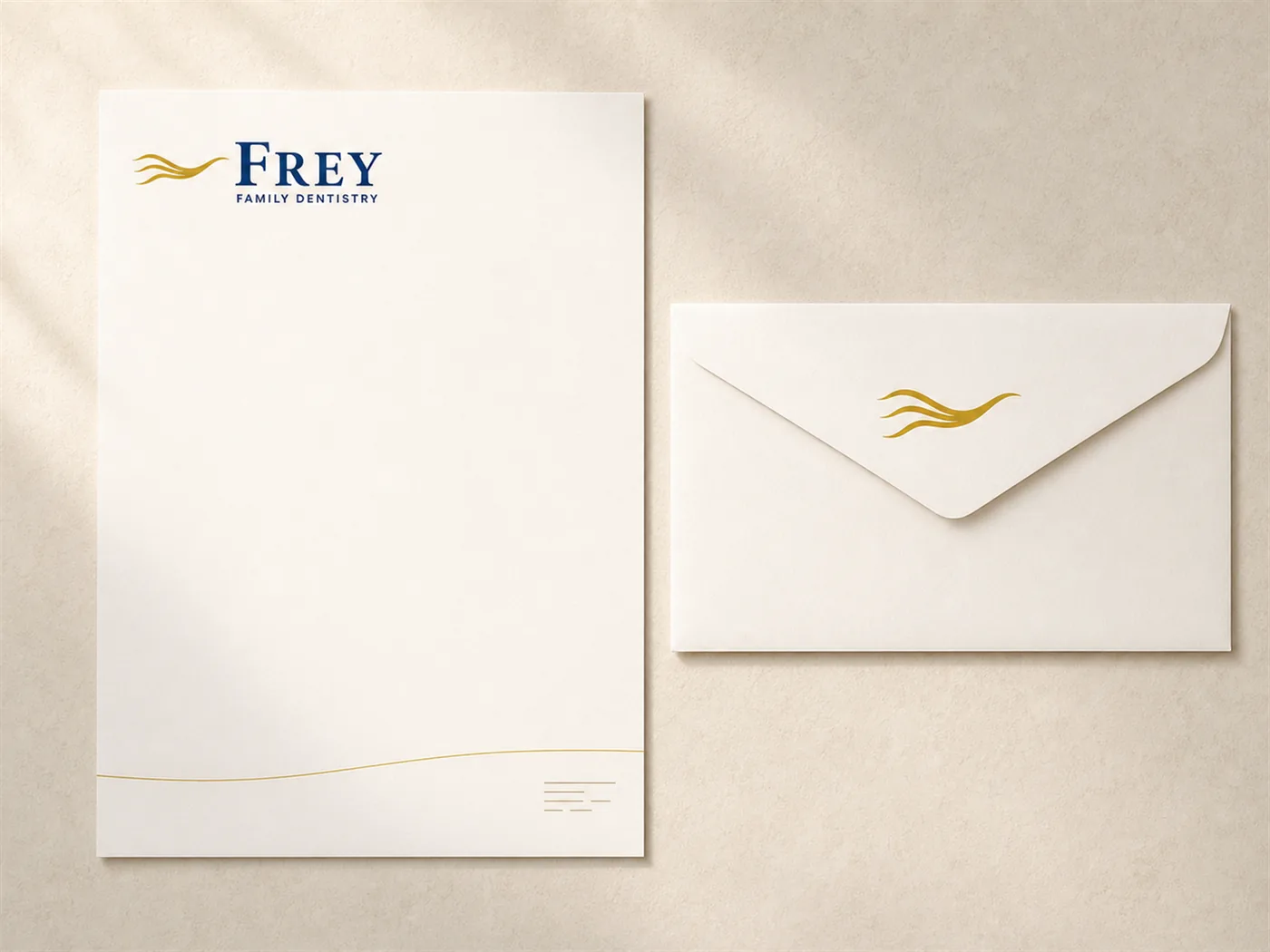
Frey Family Dentistry letterhead and envelope
Letterhead: One brass current across the foot of every letter the practice sends.
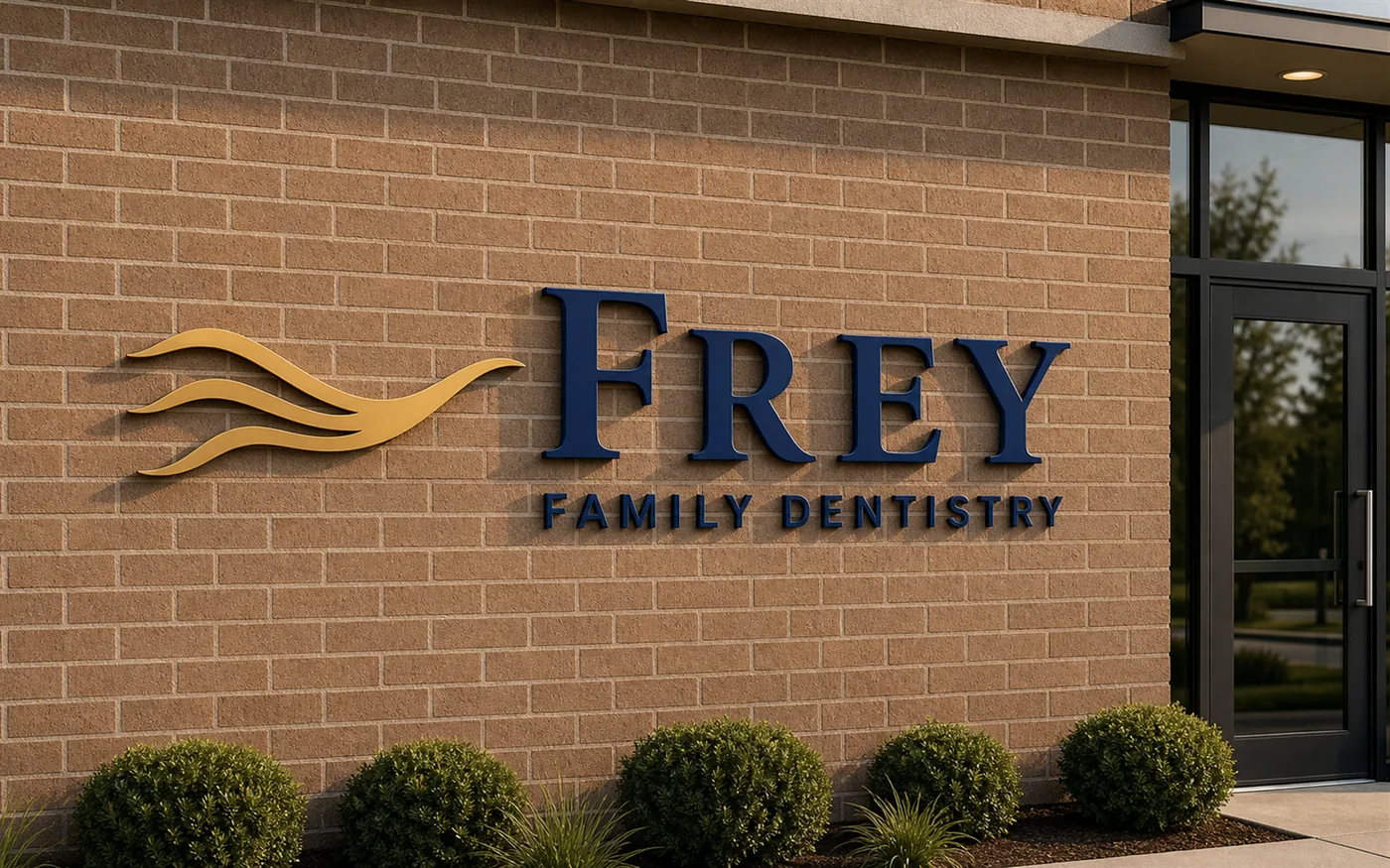
Dimensional Frey Family Dentistry signage on brown brick
Signage: Brushed brass on the real brick at 6220 Jupiter Ave.
Frey Family Dentistry appointment card
Appointment card: A blank line and a promise.
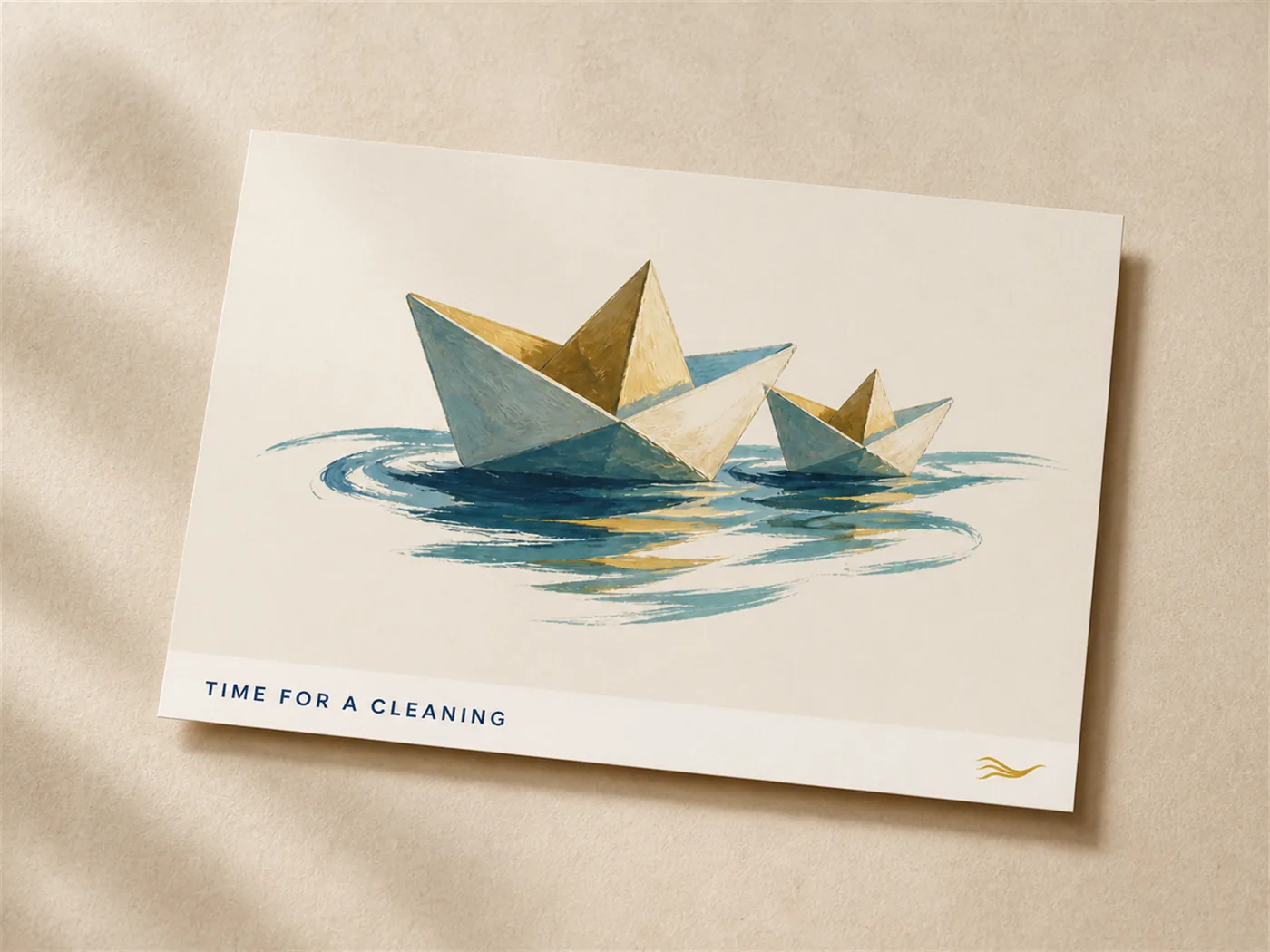
Frey Family Dentistry recall postcard with paper boats
Recall postcard: The paper boats come back when it is time for a cleaning.
Cream mug with the brass confluence mark
Mug: For the waiting room, and for Shelly.
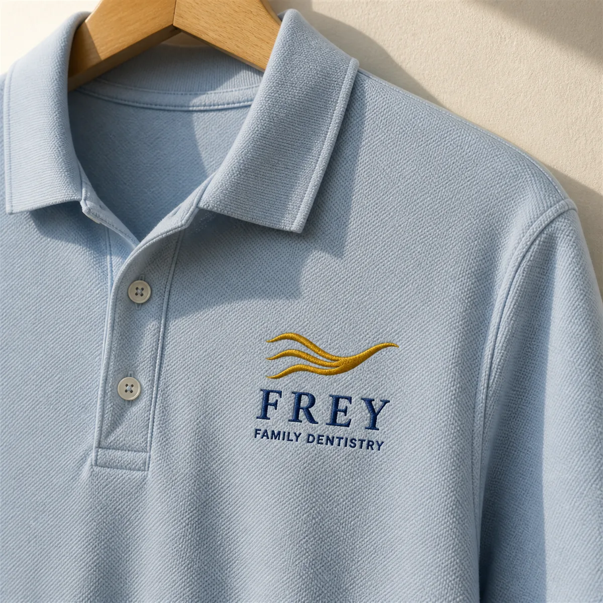
Light-blue polo embroidered with the Frey Family Dentistry lockup
Polo: Dr. Frey already wears his logo on his chest. Now it is embroidered properly.
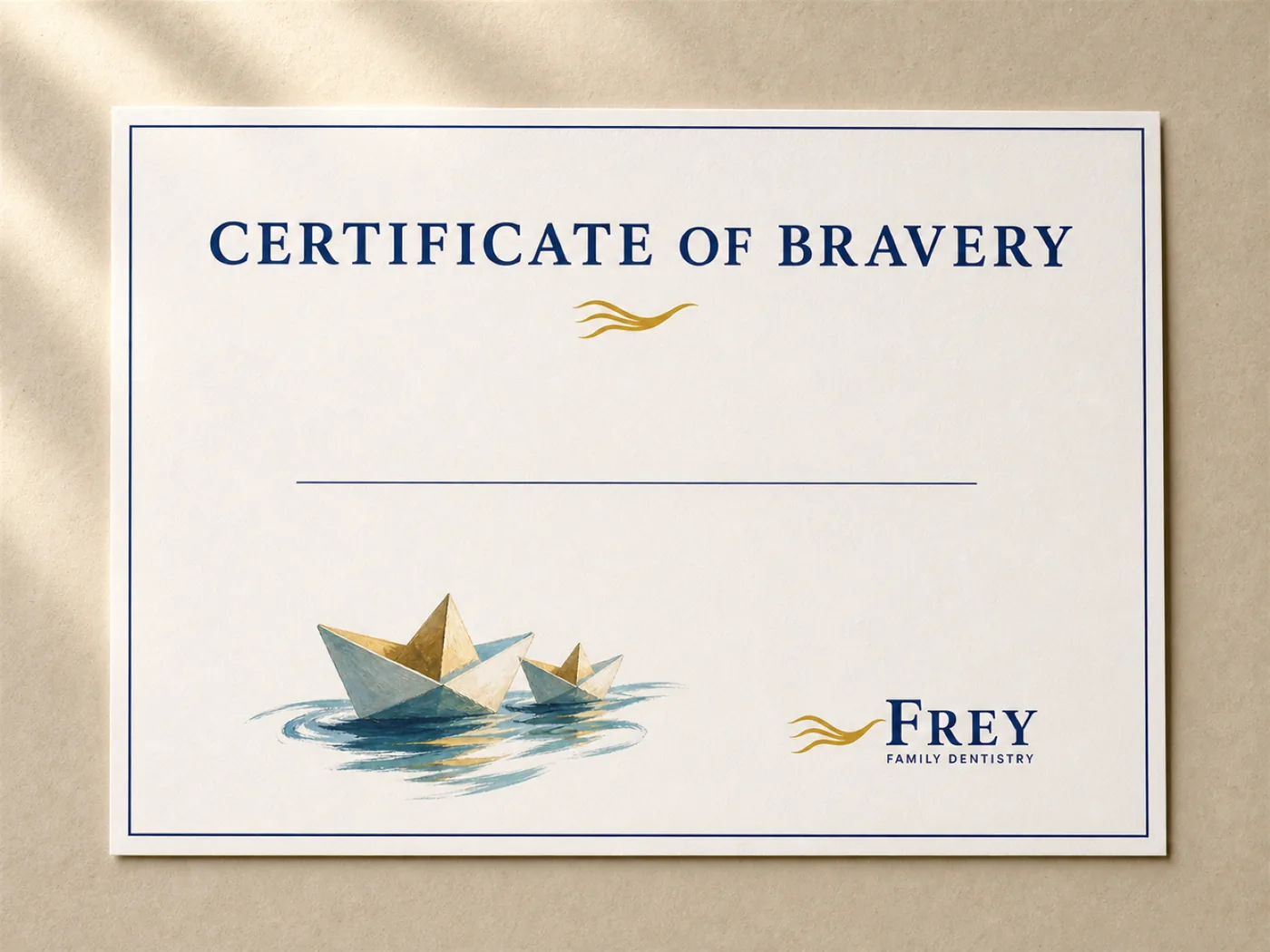
Certificate of Bravery with paper boats
Certificate of Bravery: A third of the patients are children. The brave ones get proof.
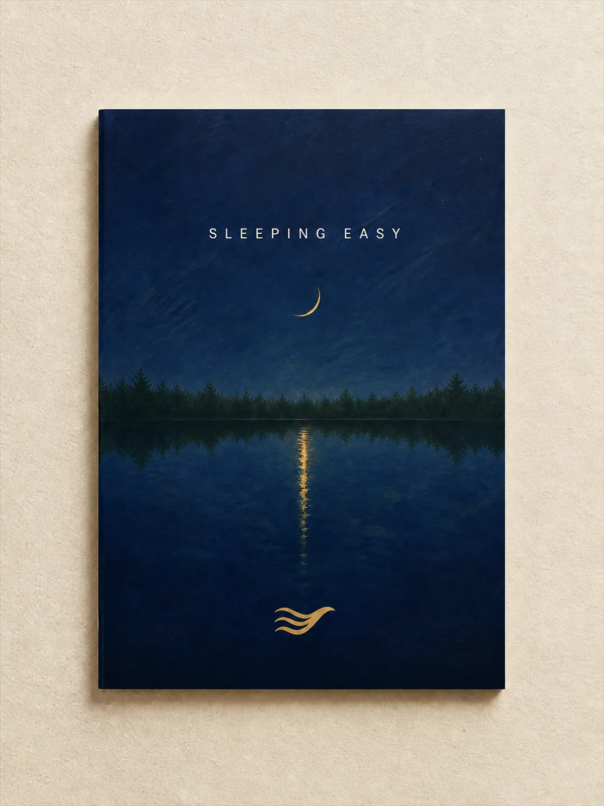
Sleeping Easy sleep apnea booklet
Sleeping Easy booklet: The sleep apnea program, bound in its own night.
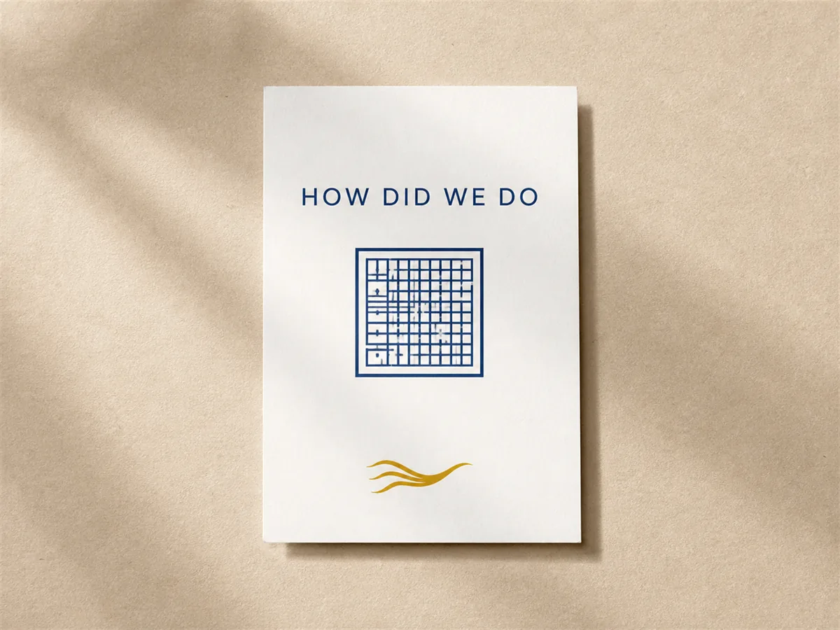
Review card with a square QR placeholder
Review card: A quiet ask, after a good visit.

One painting that is allowed to dream.

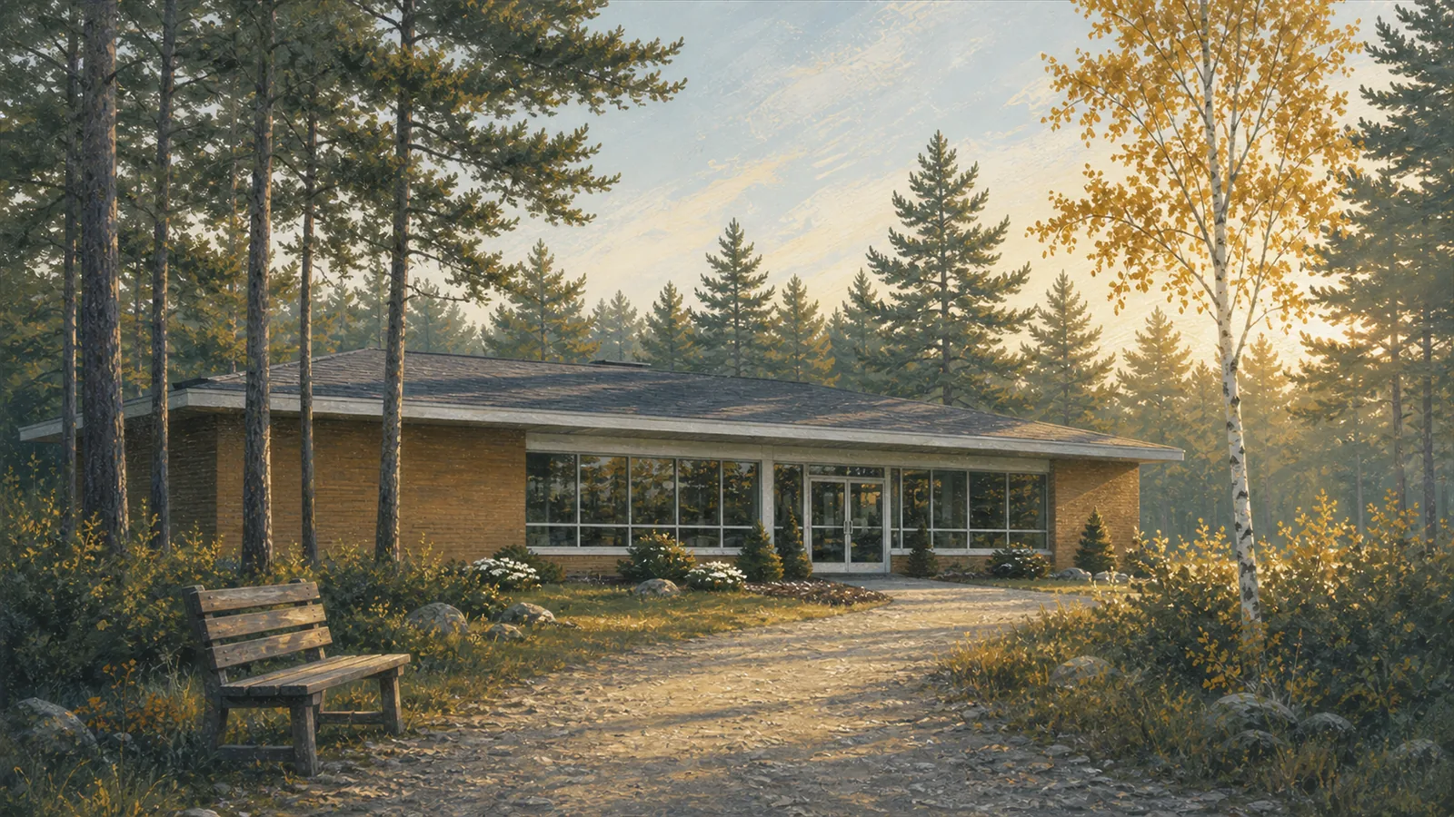
Early in this project we painted the office the way it feels rather than the way it is – the parking lot became a trail, and a bench appeared by the water. We kept the honest version for the website. But this one belongs framed on the waiting-room wall, and it comes with the brand as a gift.

A dreamlike painting of the Frey office beside a wooded trail
The office, the way patients remember it anyway.

This is what knowing a business looks like.

Every choice on this page traces back to something true about one practice in Belmont, Michigan. That is the whole method: research until the brand is already there, then build every artifact in one world – from the sign on the brick to the page that helps a patient say yes.

Built with love by the studio at bilbotherobot.com.

Frey Family Dentistry confluence mark